HOME / CASE GALLERY / SPR
SPR - SPORTSRIDEKLUBBEN
Revision of a 100-year old renowned Danish sports brand

Sportsrideklubben is one of the oldest and most renowned equestrian organizations in Denmark - well known for its Hubertus Hunt that every year attracts fifty thousand spectators as well as its rank as the biggest equestrian sports club in Denmark. The restoration of the logo was therefore an honourable task ensuring that the traditional brand could continue into a new millennium.
As is usually the case there were no real workable originals of the old brand - only photocopies of photocopies. So we decided on a reinterpretation rather than attempting to restore it to its 19th century design. At the same time we added colours - the red and black club colours of SPR and an additional deep yellow to give a bit more visual flexibility.
The logo in its original shape left and a variety of the new design to the right - including stable door emblems
The logo in its original shape left and a variety of the new design to the right – including stable door emblems
SIMILAR CASES:

FOLKEUNIVERSITETET
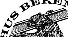
SOPHUS BERENDSEN
