HOME / CASE GALLERY / SOPHUS BERENDSEN
SOPHUS BERENDSEN
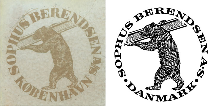
Modernization of the Sophus Berendsen logo

The original brand consists of two elements: a strong bear carrying an iron beam that Sophus Berendsen manufactured surrounded by a heavy text placed in a circle.
The original typeface used was a standard typeface without any further treatment of the individual characters to make them fit into a circle.
It gave the impression of an impassionate logo design without any feeling - although the bear in itself is quite remarkable.
The original typeface has rather large contrast between stems and hair lines but very subtle serifs (feet).
The modernization of the brand was, thus, primarily a typeface design task where the goal was to draw a clear and harmonious ring.
A smaller character height is necessary to create a greater elegance.
Furthermore, it was natural to design a typeface with heavier serifs as serifs are suitable for emphasizing the circular qaulities.
Each character carefully and conically shaped to fulful the demands that arise from a circular design and with sufficiently expanded spacing to avoid the inevitable holes created by the individual characters - for example P and A that each in its own way forms holes in the word setup.
The circular typeface should also create a visual uniqueness with a fine balance between stems and hair lines, character width and weight and emphasis of the serifs.
All this, obviously, to obtain as a result a natural encircling of the bear with a powerful, distinguished typography with slight association to monetary design.
The bear is in this version only designed to be reproduced in letterheads, etc. with a diameter not exceeding 20 mm.


