HOME / CASE GALLERY / DMD-FLEXIBILITY
DMD-FLEXIBILITY
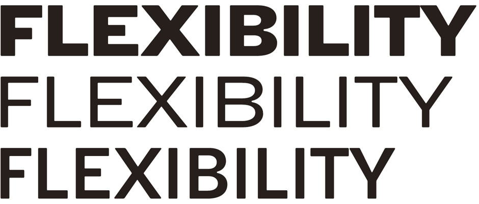

Architect/designer/professor Naur Klint's grotesque (sans serif) typeface Flexibility was designed in the era of other iconic grotesques such as Univers, Frutiger and Helvetica. Though all of these can be classified as organic (as opposed to geometrical), Flexibility has an extra "Danish" dimension that sets it apart from its peers and brings about a particular Danish Design identity.
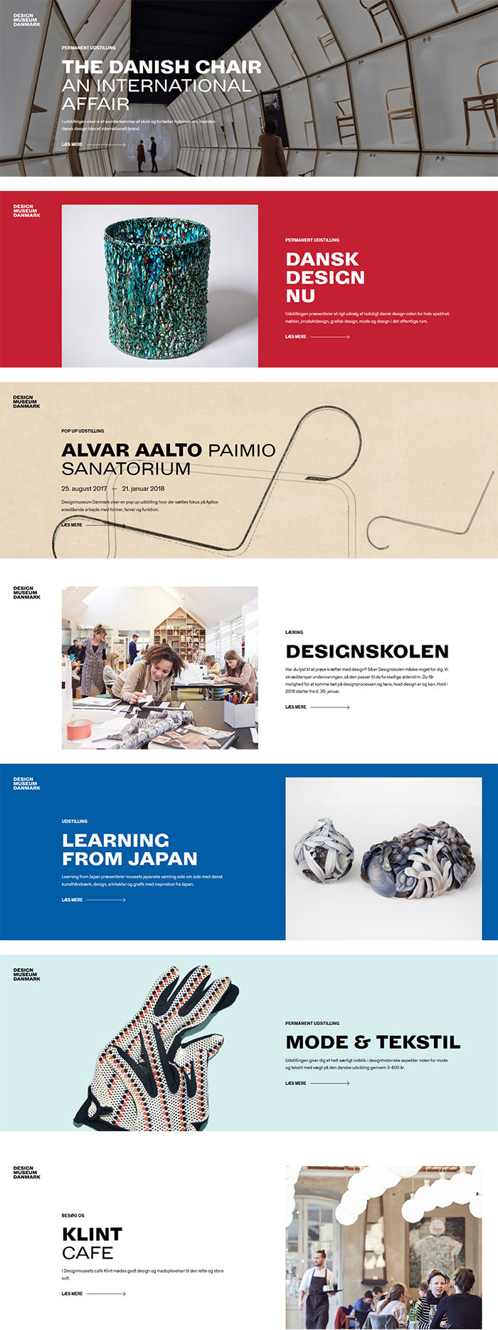
Design Museum Danmark exhibiting modern Danish design chose to have three of Naur Klint's original expressions customized for use in their signage, posters and other promotional instruments. This was done in collaboration with the museum's design agency and Lars Klint and Henrik Lisby were responsible for ensuring that the design followed the original intentions.
Left the scanning of Naur Klint's original drawings. Right the initial digital version overlayed.
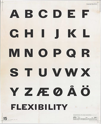
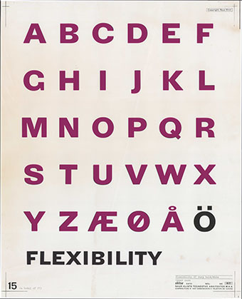
Top the scanning of Naur Klint's original drawings. Bottom the initial digital version overlayed.
DETAILS
Where it all begins - to make ends meet
Each digital character of the three expressions was meticulously and individually adjusted to get as close to the original as possible.
The digital reality does, however, offer much greater precision than strictly hand-drawn characters. The challenge is to merge these artistically.
Left the orinal scanning with digital versions super-imposed as outlines. Right the final result.
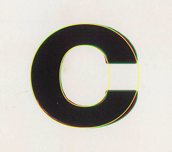
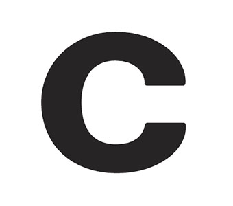
Left the orinal scanning with digital versions super-imposed as outlines. Right the final result.
Letter J is an example where we had to decide on a basic shape. Naur Klint's many expressions used different shapes of certain characters in different expressions. We consolidated these to ensure a coherent design throughout the three versions.
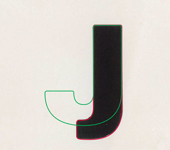
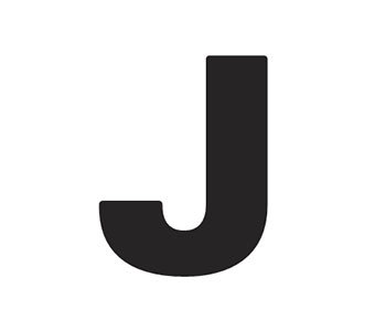
Letter J is an example where we had to decide on a basic shape. Naur Klint's many expressions used different shapes of certain characters in different expressions. We consolidated these to ensure a coherent design throughout the three versions.
Letter M used a quite distinctive entasis (slope) of the skewed strokes. This appeared a bit too drastic for its use and was minimized in the final version.
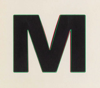
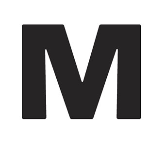
Letter M used a quite distinctive entasis (slope) of the skewed strokes. This appeared a bit too drastic for its use and was minimized in the final version.
A characteristic of Flexibility is its use of rounded corners. Letter Q shows how we worked with these to ensure balance between outer and inner cornering.
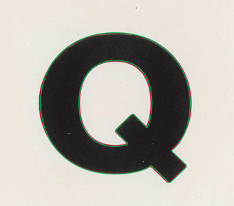
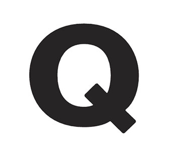
A characteristic of Flexibility is its use of rounded corners. Letter Q shows how we worked with these to ensure balance between outer and inner cornering.
Letter Q close-up. The red outline shows the initial digitalization - the green shows the adjusted one.
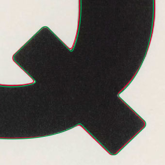
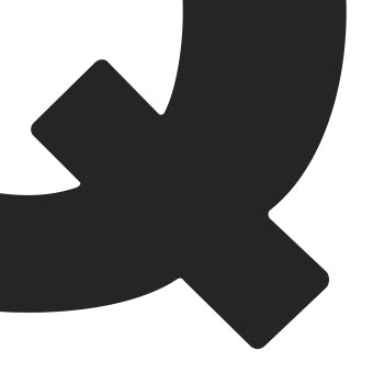
Letter Q close-up. The red outline shows the initial digitalization - the green shows the adjusted one.
The Danish letter Ø is generally mistreated in tapefaces designed by non-Danes. Typically the skewed mid-stroke is too thin. We fattened it a fraction to ensure coherence.
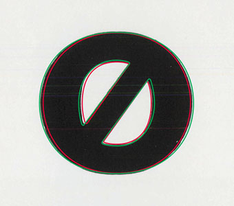
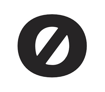
The Danish letter Ø is generally mistreated in tapefaces designed by non-Danes. Typically the skewed mid-stroke is too thin. We fattened it a fraction to ensure coherence.
ALPHABETS
The three expressions
This customized Flexibility was designed in three versions based on the original H7 (bold-extended), C7 (normal-extended) and E5 (semibold-normal).
H7 and C7 are used for headlines, E5 for further descriptive text typically in a smaller size - that's the reason for boldening it a bit more than C7.
The three expressions: H7, C7 and E5 based on Naur Klint's original drawings.
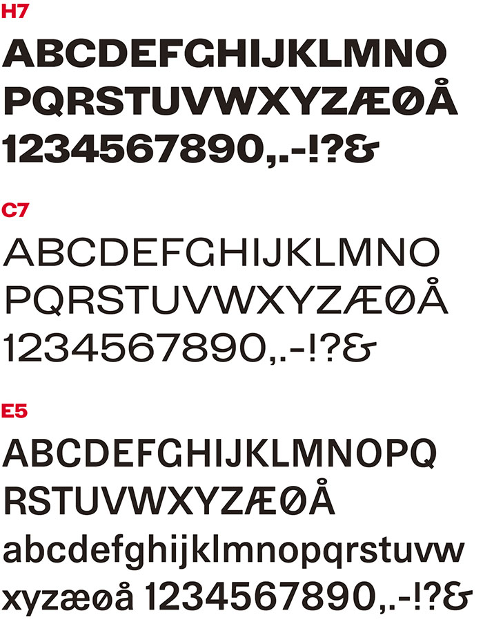
The three expressions: H7, C7 and E5 based on Naur Klint's original drawings.
FLEXIBILITY IN USE
A visual identity based on an iconic typeface
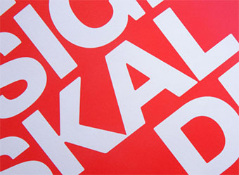
A good example on how powerful typography really is. Flexibility creates an aura of uniqueness that it would be hard to create by using standard typefaces and other elements.
Flexibility is aside from being the logotype being used primarily for headlines and short descriptive texts on posters, in brochures and website.
Design manual developed by Urgent Design. Logotype and brochure.
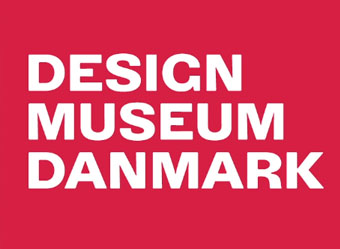
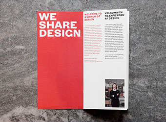
Design manual developed by Urgent Design. Logotype and brochure.
Stationery and close-up.
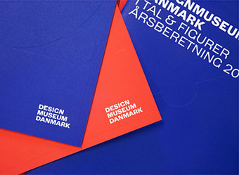
Stationery and close-up.
Website posters.
