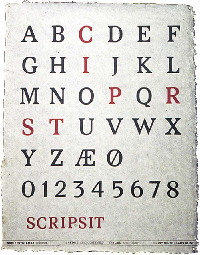
HOME / CASE GALLERY / SCRIPSIT ALPHABET
SCRIPSIT ALPHABET
Typeface design and identity
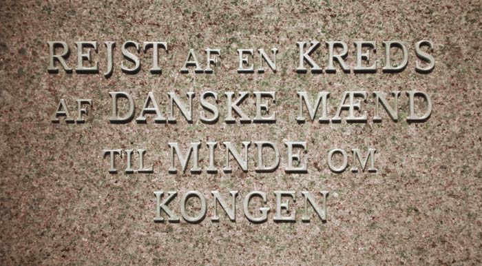
The alphabet was designed by Lars Klint for the restoration of the inscriptions in Fredensborg Palace Gardens. The inscriptions were badly damaged,
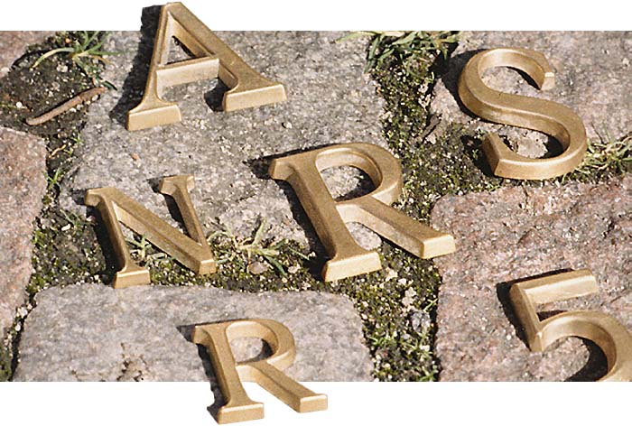
not least due to an unfortunate trend among some people to obtain one's initial letters from one of the sculptures and then wearing them around one's neck.
The inscriptions were originally created in different eras, and therefore, with different styles. These styles often have one or more new characters,
all of which were characterized by not fitting into the existing inscription. So, heft of letters is not a new phenomenon.
All inscriptions are/were designed in the Danish bronze typeface "Frederik V" which exists in as many versions as there have been type foundries.
It was the version of the typeface that the individual bronze foundry had that was used for the inscription.
Frederik V is generally not uniform in its character widths and at the same time without the strict rigor known in Capitalis Quadrata.
This is not due to ignorance throughout history, but the idea of graphical "tidiness" was different then.
Often there was not a sufficient surplus material both to
make a beautiful sculpture and ensure a nice inscription. The fact that there was an inscription was in itself enough to inspire respect.
The main purpose of designing Scripsit was to create a modern Frederik V - an antiqua suitable for casting of individual characters.
Another factor in addition to ensuring a high graphical quality,
was to make it difficult to steal the individual characters and with no part of any letter thin enough to invite attempts at vandalism.
And of course a desire to show our contemporary graphic stage of inscriptions, which must last for the next several hundred years.
SIMILAR CASES:

INSCRIPTIONS

SIGNS AMALIENBORG
