HOME / NEWS AND ARTICLES / ENTASIS
ENTASIS
It is not only in the field of graphic design one finds deliberate inaccuracies
Some buildings are simply better placed on the ground than others.
This is not something we can immediately see, rather it is a feeling one gets.
If we look closely at the individual buildings, some of them have proportions that just seem natural, while others appear less complete - like something is missing.
Why this is so has of course always busied architects.
It led to geometry being substantially implemented as geometry can be measured and quantified, whereas it is considerably more complicated to use feelings and hunches as a basis for measurements. Therefore, geometry became an important part of the architectural language.
Everyone knew the Golden Ratio, a term today associated with more than just the proportions of buildings.
Today the notion of a building "firmly placed" on the ground doesn"t occupy architects any longer - rather the opposite - resulting in geometry as a tool of proportioning to be forgotten.
One of the more complete buildings based on the Golden Ratio is Bethlehem Church in Copenhagen, where the Golden Ratio is evident in both plans and sections and even in the room volume. Kaare Klint 1935-37.
Parthenon, Athens, Greece

Parthenon, Athens, Greece
A most admired work is the Pantheon in Athens.
Temple ruins are measured and studied in depth as Pantheon is a highly interesting piece of architecture.
Throughout the 19th century architects marveled at the fact that Pantheon and other Greek temples were built on a slightly arched surface.
The concept was explained by the notion that the horizon also arches.
Easier to understand and explain is the fact that the pillars were carved slightly thicker at the middle than at the top and bottom.
The reason is that a geometrically straight column appears to be thinner at the middle - it looks like a concave lens - and in order to counter this optical phenomenon the columns were carved slightly thicker at the middle.
It may not have been the Greeks who actually invented such visual inaccuracies, but they named it entasis as they to such a great extent used optical adjustments and corrections.
Around the year 600 BC they had become so rich that they had the courage and ability to build temples in marble, replacing past wooden buildings.
It was no longer sufficient for the building alone to provide protection from wind and weather, the temple also had to express that it was created by the best - that it was built for eternity.
Top line shows the O without any entasis - it appears too small. Second line shows O with a correct amount of entasis applied.
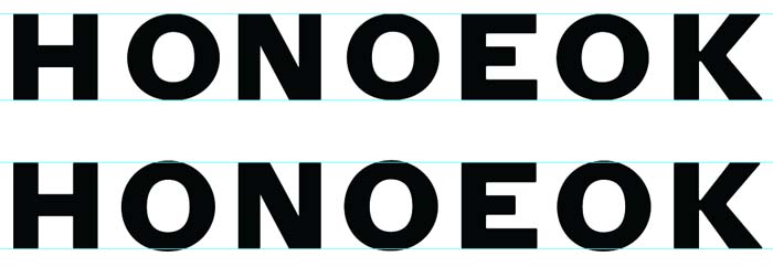
Top line shows the O without any entasis - it appears too small. Second line shows O with a correct amount of entasis applied.
The Greeks applied their knowledge of the way we perceive things visually in their architectural design, so they built with a conscious choice of curvature horizontally and vertically.
At Parthenon the stylobate, the platform which the temple is placed upon, arches 100 mm lengthwise and 70 mm across.
(Danish architect Mogens Koch indicates that Penrose has measured the curvature to 172 mm and 66 mm respectively, but of course it is associated with problems to measure a curve on a ruin that has been subjected to earthquakes).
The top of the columns arch correspondingly. The eaves are not horizontal.
This is what it takes to ensure that the horizontal elements are actually also perceived as being horizontal.
No straight lines are straight, but we perceive them as straight when they curve slightly.
Geometrically straight lines curve slightly visually.
Furthermore, Pantheon's columns are placed slightly askew.
All these deliberate inaccuracies are necessary for the viewer to perceive the whole building as extremely harmonious.
Everything is as it should be - and the fact that this also improves structural strength is just an added benefit.
All are details that we do not immediately discover without deliberately looking for them.
And when we look for them, they suddenly become too obvious. In other words, they are not there to be studied - only perceived.
Quite similarly a good logotype or alphabet follows these rules and all curves go above and below the geometric x-height.
O is higher than M, but also in the detail there are deliberate inaccuracies, not to be seen, just to make sure that the final result looks right.