HOME / CASE GALLERY / NATUR IS
NATUR IS
Company and product identity design

For a local dairy, we developed a logo and product identity design for a new ice cream: NaturIs (Natural Ice).
It was a product of very high quality (and relatively high price), however,
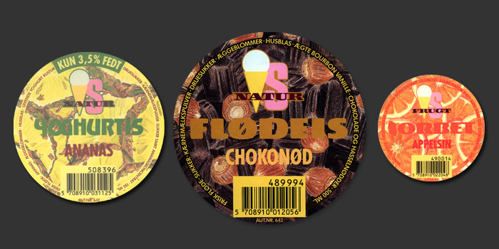
the total marketing budget was limited. It was more or less left to the packaging design alone to sell the product...
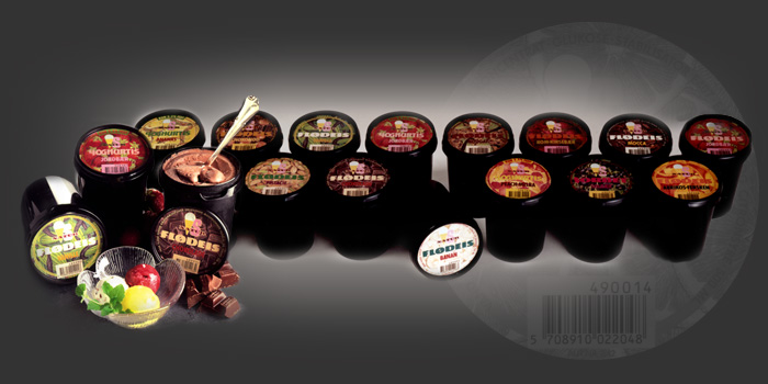
We were the first to suggest black packaging (with colourful labels) for ice cream back in the early 1990s, and sales exploded by several
hundred percent during the first weeks after the new packaging was introduced.
Project content:
- Logo
- Sales material
- Packaging design


